How to Fix Your OnlyFans Page So it Gets More Subscribers
With limited options your OnlyFans subscription page needs to sell your potential fans on taking the next step

OnlyFans How-To Guides – OnlyFans Subscription Page : Last Updated: July 9, 2021 Reading Time: 18 Minutes
One area that is rarely talked about but a key to success on OnlyFans is what happens when someone comes to your OnlyFans page and they need to subscribe to see more of your content. This is the so called ‘moment of truth’ for you and what all your efforts we’ve discussed in our OnlyFans Marketing and Promotion articles have lead up to. So how much time has the average OnlyFans creator spent on this crucial moment in their business success? I’d say none or hardly none at all and that’s because very few creators ever look at their page from a customer perspective. They say if you want to buy a business you need to work in a business similar to it for 6 months to see if you like it. The CBS Television show Undercover Boss became popular because the CEO’s actually had to go and work in their own companies for a few days and experience what the people on the ground do. A simpler way of putting this is, how often do you taste your own food before you serve it? This article isn’t about the content you produce though, it is more about how you are presenting your meal good or bad on the plate. I’m a huge Gordon Ramsey fan, as I’m sure most people who strive to achieve goals in this world are. One thing Gordon Ramsay and all great cooks focus on is ‘plating‘, the concept that the better food looks when it comes out to you the more likely you are to enjoy the food. It’s true though even if the food itself is sub par a great presentation can really make you feel like you had a great meal. This article is going to be about how you plate your OnlyFans Page in front of the subscription paywall.
Why Even Bother Optimizing Your OnlyFans Profile Page?
So you’re going to think to yourself, what does it really matter what the page looks like when they get to it, shouldn’t I have done all the work needed to sell my subscriber before they even get there? The sad fact is that people change their mind about purchases and they do so a lot. According to Bar Alliance, They found 78.65% of ecommerce carts were abandoned before purchase. That means, over 3/4 of shoppers choose to leave a website without completing a purchase. People went to a site, dropped items into a cart they knew they wanted and yet still 75% of them rolled out without getting anything. Think about how this is across an industry that has such powerhouses in it as Amazon and Apple that spend billions of dollars creating brand loyalty and sales just for that singular moment of purchase. Do any of us have the resources most big ecommerce platforms have to make sure that our potential clients don’t leave before they click “subscribe” on an OnlyFans page? So let’s say if we’re being generous that 3 out of 4 people at minimum are going to hit your OnlyFans page, think about subscribing and then leave. To put it another way imagine if right now 9 out of 10 people are going to your page and not subscribing and by making a few changes you could bump that up to 8 out of 10, you’d double your income from the site overnight.
Limited OnlyFans Options Means Maximizing What You Do Have is Key
Let’s be honest right now an OnlyFans Profile page is very very limiting as far as what you can do with it. As we discussed you don’t even have the ability to create meta information for your page so that Google can find it easier for search terms. The site is generally setup in a way that you often wonder how anyone is really succeeding so well on it? Luckily with very few factors to work with it means you really only have a few areas that you can improve on to get your conversion messages across to potential subscribers. It also means that these factors will have an out sized effect on your success on the platform.
What Are The Main Areas To Concentrate on For Subscriber Conversion?
I have placed links to the different places on your subscription page that you can work on improving. You can jump to different parts of the guide depending on what area you need to work on or read the whole guide one area at a time.
- Your OnlyFans Banner
- Your Short OnlyFans Bio Statement
- Your OnlyFans Subscription Descriptor
- Your Displayed OnlyFans Stats
- Your Displayed OnlyFans Posts and Media
- . OnlyFans Price Origami
Conversion Page Factors
Before we begin discussing each of the main areas of your OnlyFans Page you can control I wanted to go into some basic Conversion Factors that I will be referencing.
- Focus – Pages with one link or call to action typically convert better than those with a high number of links or a lot going on on the page. This means that visitors are more likely to take action if you zero in on one action that you want them to take.
- Page Speed – The quicker that someone can get to what they want the more likely they are to take action on your page .Sadly OnlyFans seems to load slowly everywhere and for everyone. People are used to the slow load time and there is nothing that you can do to slow down or speed up your page.
- Eye Movement – If you are familiar with how a persons eye moves around a page you will know where to put your most important information and be able to convert them better.
- Word Count – When you are trying to convince someone to buy or take action surprisingly less words equals more user action. Most studies on webpage conversion say that pages with 100 words or less do better at converting than those with 500 or more.
- Social Proof – This concept is that people want to see information from a source other than you lauding your attributes or what they are about to buy. This can also be referred to as Social Authority, meaning if trusted authorities say good things about you then you must be trustworthy yourself.
- Value – Those pages that can convince you that you are saving on what you are buying or that you are offering them a lot of something as compared to another product or service will convert better. People like to feel like they are getting a bargain or saving in some way.
- Above the Fold – This is the space on a web page that does not require the viewer to scroll or page down to see it. This is the area that will get the most initial attention from anyone who visits your page.
OnlyFans Subscription Page Factors Within Your Control
1. OnlyFans Banner Optimization
Example 1 of a well crafted banner: Natalie Monroe
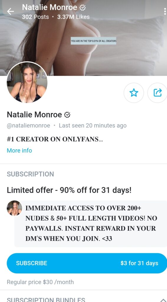
So why am I discussing a banner and not the Bio Image on the OnlyFans profile as a decisive conversion factor? First in almost every way the bio picture is so small that it plays only as a factor of identifying a vague outline of what you look like and that someone is likely on the right page. With the majority of OnlyFans users on mobile devices the real star of the visual show on a profile page is the banner. This is where you can do a lot of different things including:
- 1.Re enforce your Brand Image
- 2. Remind the potential buyer of their desire for you
- 3. Entice the potential subscriber to want to see more
- 4. Establish your Social Proof
- 5. Direct the viewers eye towards your image making the price the last thing they see, not the first
- 6. Show Your Popularity on the Platform from your desired stats
In the example of Natalie Monroe, she is utilizing a picture where she is nude, which lets the users know what kind of content to expect behind the paywall. The picture is also in bed, giving the potential buyer the allusion of being with her in that scene. She is not making eye contact nor showing her face again as the banner format would distort her face. Sadly banners are bad at showing anything vertical although this is what our eyes prefer. She manages to provide a vertical position which asserts dominance over the viewer. Her clever trick is to use the ‘you are in the top 0.1% of creators’ tag over her chest. It is clever because it is almost too small to read which make the eyes desire to stare in closer. She establishes her brand image as a top OnlyFans creator, the picture reminds the viewer that they desire more from her and she draws their eyes to both her body and her popularity. This is a picture perfect example of a well formatted and effective banner for her profile.
Example 2 of a well crafted banner: ShayBaby
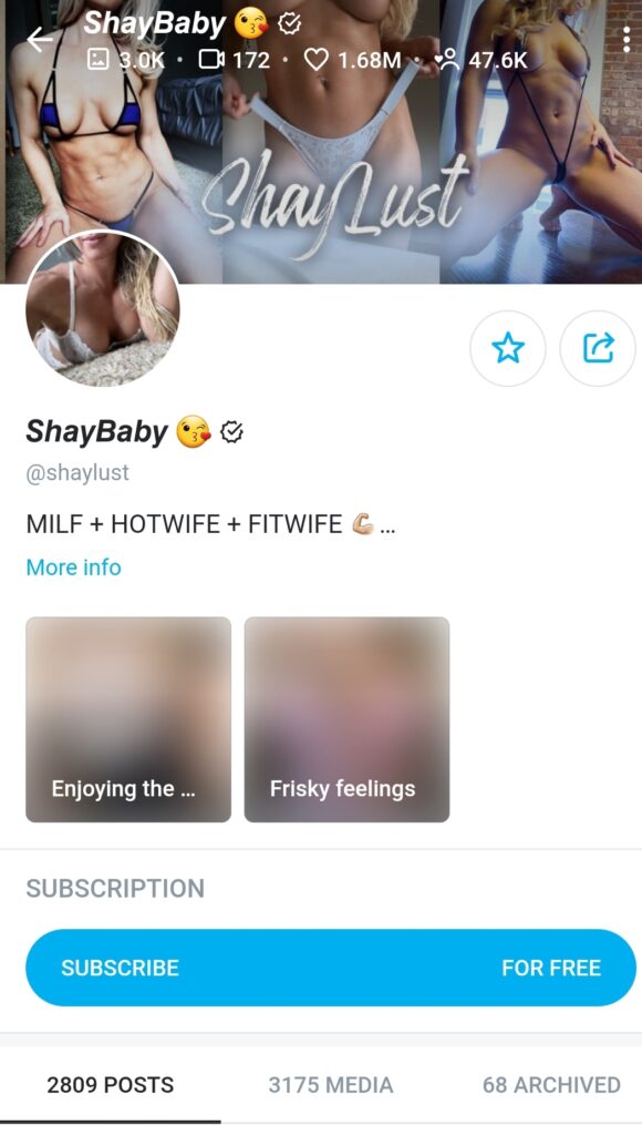
Shaybaby goes even further than Natalie on her profile in establishing her brand and re-enforcing what is being stated on the rest of her profile. Shay let’s you know in big capital letters that she is a “MILF, HOTWIFE and FITWIFE” and her banner ad shows exactly that. She showcases herself in 3 different vertical poses all centered around the least amount of cloth possible to cover up the NSFW parts of her very fit body. Her banner establishes her brand in Bold Letters “ShayLust” and does so in a way that does not take away from the pictures. She shows off all of her stats in the banner as well, with her likes, fans and her over 3K pictures! She hits on all 5 conversion factors mentioned about as her banner picture certainly makes you want to see more. You get the feeling that she has a lot of outfits to show you since she is modeling 3 different ones on her banner alone. I also like the subtle fade at the bottom that ties all of the pictures together.
2. Your Short OnlyFans Bio Statement
If you read my article on Optimizing your OnlyFans page for Google, you’ll remember that Google has a Meta Title limit of about 55 characters before they will cut off the title to potential clickers. On Your OnlyFans page you have about 50 characters that will appear before someone will need to click on ‘More Info” to see more. These 50 characters are very important to the success of your OnlyFans page and you should think long and hard about what you place here. There are a few core strategies that top creators are utilizing.
- The Bold Statement – This is a statement meant to shock and entice your potential subscriber. Example: “Your Friendly Neighborhood Thot’
- The Disarming Honesty Statement – This statement helps humanize you so potential subscribers can relate to you. ‘Going to Post Daily if my ADHD lets me’
- The Keyword Descriptor Statement – This is a statement that helps you appear when someone makes a particular search Example: ‘Big Boobs, Big Butt, Bigger heart’
- The Dirty Words Statement – This is to go right for the jugular on those people looking for someone who has no qualms about getting down and dirty Example: ‘I’m the dirty **** who ***** your Dad’
- The “Hey” Statement – This is a statement that is very popular and makes the person feel welcome right away on you page Example: ‘Hey It’s Kayla, Welcome to my Page’
What You Should Not Put in your Bio Statement:
- The Start of a rambling text
- A Subscribe statement
- Nothing
- Talking Down to Your Audience
3. Your OnlyFans Subscription Descriptor
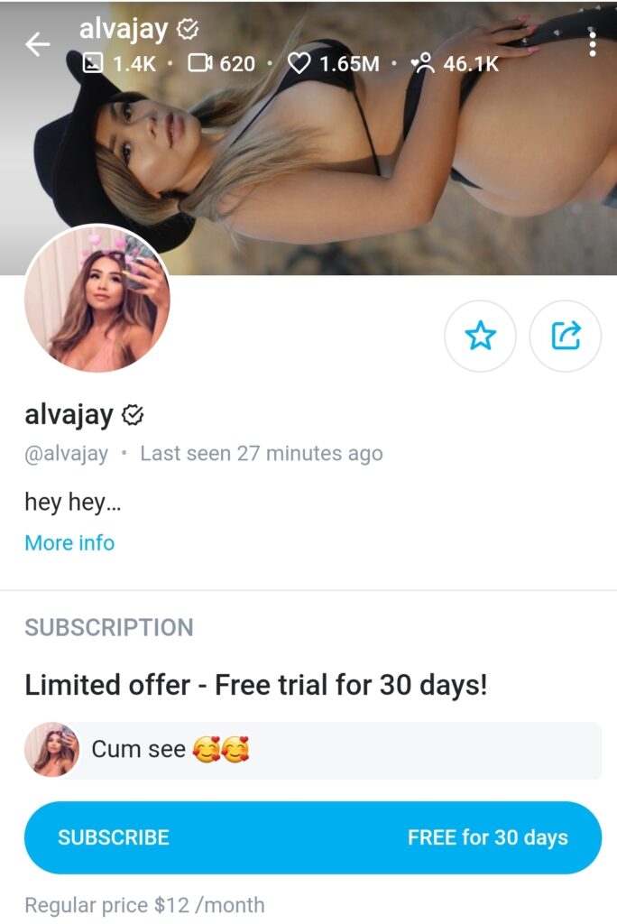
Many top OnlyFans creators know a trick that gives them a lot more room to speak to potential subscribers and that is to always be running a subscription special. When you run a subscription ‘Limited Time Offer’ it appears right under your short bio description but guess what else you now can do, write a ton about your behind the paywall content and it will all appear above the fold to your potential subscribers. You can see in the example above from Natalie Monroe earlier that she uses it to describe all the features of her page. Below you can see creator ‘hempresskc’ utilizing it to promote her live show on her page above the fold.
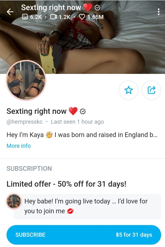
This one technique doubles the amount of words you can utilize and unlike the bio text is can be formatted to be bold and be put behind a grey shaded area standing out even more. It also seems less like you are being shouted at when you use capital letters in this area as opposed to your bio page.
4. Your Displayed OnlyFans Stats
There was a time not too long ago when someone showing 50K likes on OnlyFans on their page profile was astronomically high and impressive. Now that number can almost be commonplace and not gain much attention at all. Luckily the general pursuit of likes on OnlyFans has been replaced by displaying your content numbers and making sure that you are providing quality content to your fans. One thing to remember is that you have control within your settings for what you display to potential buyers. I wrote about this in the 101 OnlyFans Tips and Tricks and making sure that you show what will help you gain more fans and subscribers is as important as ever. Here are what you can show or not show to your potential subs.
Posts:
When to List it: Posts are something that can show a potential buyer how active you are on your page and likely how active they can expect you to be in the future. If you have been posting on OnlyFans for a while its hard not to have a high number here so you should list it.
When Not to List it: If you are just starting out on the site it can look a little sparse when it says Posts: 10. It reminds everyone that you are new for sure. If you have a huge amount of followers but very few posts this is also a display stat to avoid
Pictures:
When to List it: This is pretty standard, if you have a high amount of pictures you should list your media in the top banner area. People also expect a higher picture than video count as well. So if you have a high amount of pictures you want to list it so people know they will be getting a ton of picture content as soon as they subscribe.
When Not to List it: If you are just starting out you will likely want to keep your media count off of your top banner completely including pictures until you have built up enough to make it impressive.
Videos:
When to List it: Video content is a lot more popular on OnlyFans than picture content. You’ll notice a lot more likes and engagement on a video overall. Having a large amount of videos will impress potential buyers so you want them to see it in your banner area.
When not to List it: If you have just started your OnlyFans or are mainly into posting pictures on the site and not videos you’ll want to avoid displaying your video count.
Likes:
When to List it: Honestly you should always list your likes on your profile. This is the one stat that ads up quickly as long as you post consistently. Typically people will like both media and texts posts.
When not to List it: You should only not list likes once you have enough other things to list like Fans and Media that your likes are almost meaningless. Although there is an argument that once you have 100K likes or more that looks impressive on its own. So there are very few cases where you want to leave off your likes.
Fans/Followers:
When to List it: This is the trickiest of all the items you can display in your banner area. The issue comes from “free” pages that end up counting followers as fans. This can make even a high count of paid subscribers look small in comparison. If you have 1K actual paid fans you are doing amazing but it won’t stand out against a free pages 100K Fan/Followers. In most cases you should only list this on a Free page where it will look like a very impressive number.
When not to List it: It is a safe bet that in most cases from a conversion basis you don’t want to list your paid subscribers on a Paid or VIP Page. If you just are very excited to have 100 Paying Fans and are in a small niche there could be some benefit in posting this. In most cases though you want potential buyers looking at your Media Count and Likes which help establish your Value Proposition and Social Proof.
5. Your Displayed OnlyFans Posts and Media
At this point several years into OnlyFans there is a distinct advantage in having a large amount of media ready for your potential subscribers to view. I did go over when talking about the success secrets of the top 1% that less can sometimes be more when it comes to content. But if someone is deciding between you and another creator the amount of displayed content can be a deciding factor.
Depending on the amount of information you place on your page the Posts/Media/Archive numbers will appear to those just entering your page. You can see on Jessica Nigri’s Free Page that this information is seen right away.
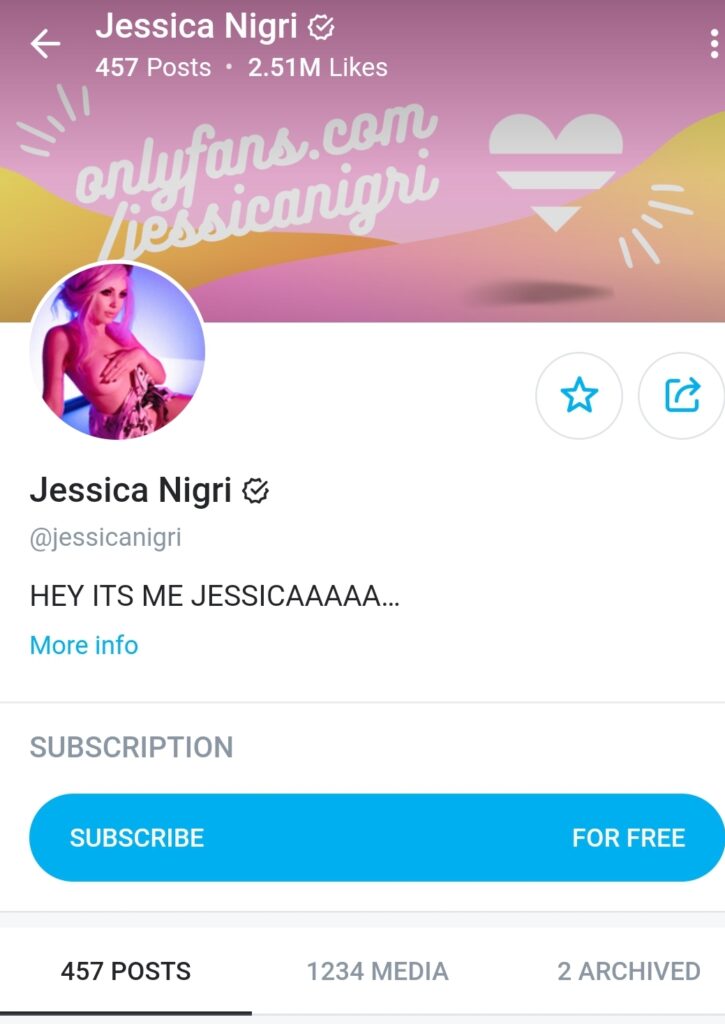
One mistake being made on this page is that it shows Jessica provides a good amount of media but her interaction and connectivity on her page is low. As a potential subscriber you’d be hoping to see a lot more posts than total media displayed
You also don’t want to forget that your Archived material is displayed as well for all to see. As we went over in our OnlyFans Tips and Tricks, your archive stores items for future use. In her case if she is only going to have only 2 items archived it shows low interactivity and is a small number which could cause someone to not want to interact with her page by following.
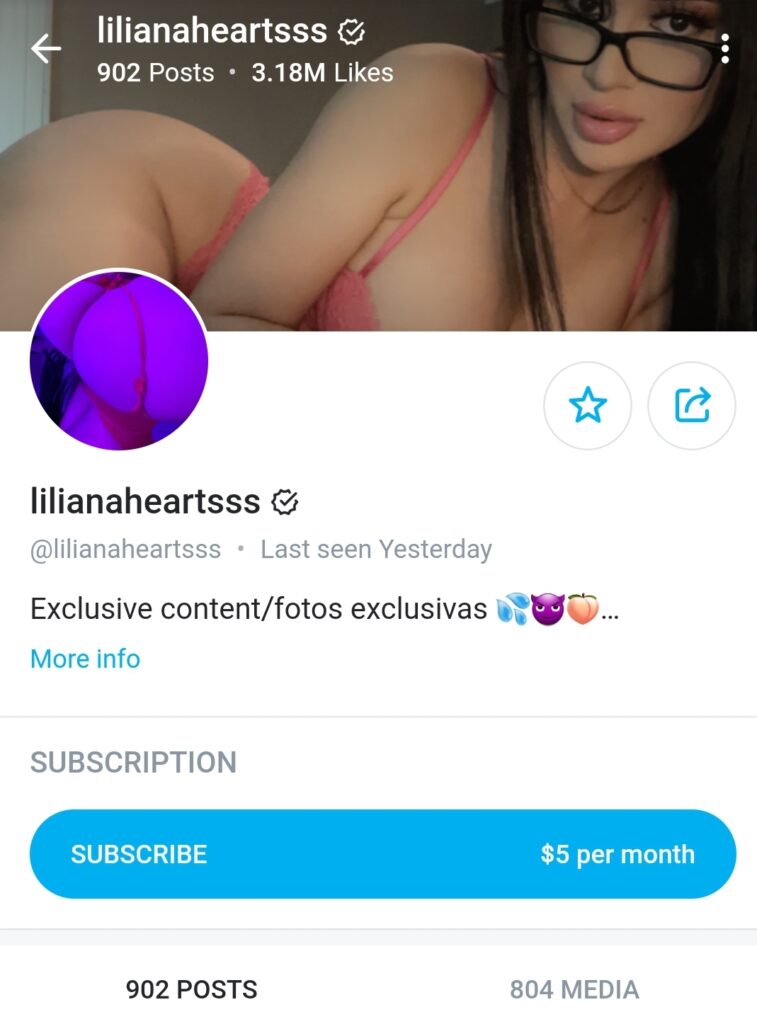
More ideal is creator lilianaheartsss who’s media and posts align well together and show that she both posts to her fans as well as uploads a good amount of media.
OnlyFans Price Origami
I like to call the never ending sales, limited time offers and specials that OnlyFans allows creators to post on their page Price Origami. Much like the ancient Japanese art you want to be sure you are maximizing your Price structure to get the most real estate possible for sales speak. I am not going to talk about how to set up your pricing on OnlyFans at the moment but more how to utilize Price Origami to sell those who come onto your page. As pointed out above you can use Limited Time offers to send out messages on your account but more importantly you can utilize the space to further sell potential subs on why they should be buying from you.
Good Ways to Use Price Origami on OnlyFans
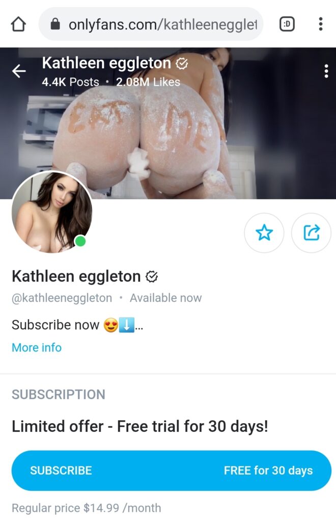
- Limited Time Offer – Free for 30 Days – This is one of my favorite uses of a ‘how can I say no to that?’ kind of conversion factor. This is letting people know they can follow you for free now but there is actually a value to what they are getting for free. For most Free pages people will assume they are going to be hit with a lot of ads for other creators or PPV content. This lets them know they are actually getting something. It also lists the regular price underneath. You can see this in Kathleen Eggleton’s page:
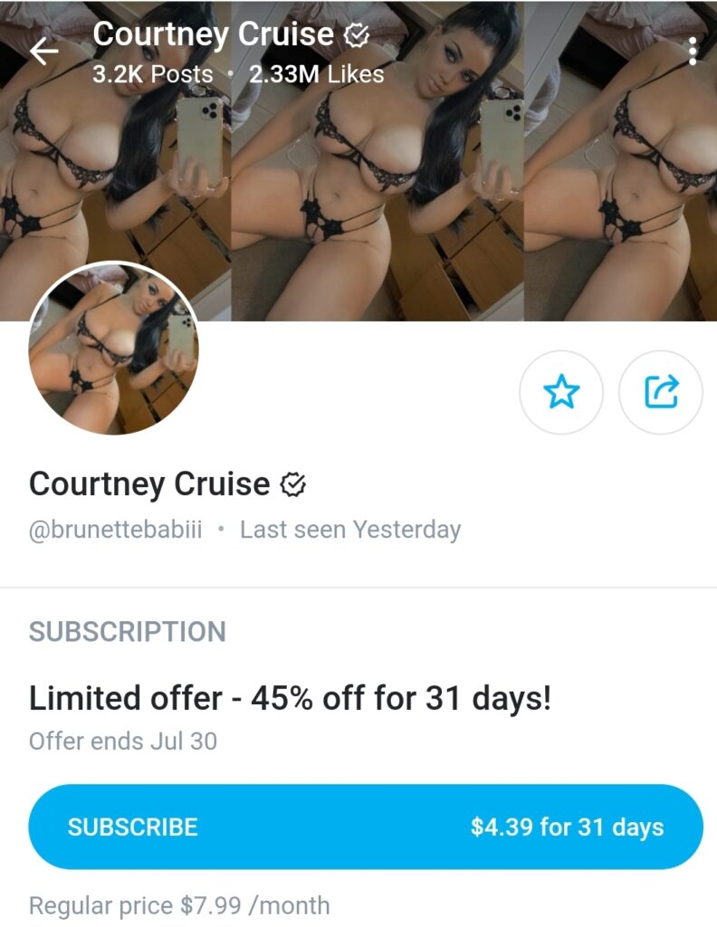
2. Limited Offer – 45-50% off for 31 Days – This is another great conversion technique. As mentioned people always like to feel like they are saving something. You might have wanted to sell your page for $10 to begin with but wouldn’t it look better if you told them that the page was worth $20/month but you are selling it to them for $10? In the end you get what you wanted to begin with and the client feels like they have saved. Even better those who don’t pay a lot of attention or even care will re subscribe after 31 days at an even higher amount. This technique is both good for conversion and revenue. You can see how Courtney Cruise uses it below.
Other Above the Fold Items on Your OnlyFans Page
You may have noticed in the displayed images of OnlyFans creators that some are displaying visual items as well within their pages to get further attention. I will say that in most cases I feel this is wasted space because it is not leading to the eventual conversion goals we talked about before. You can see below PeachJars use of Spotify on her profile.
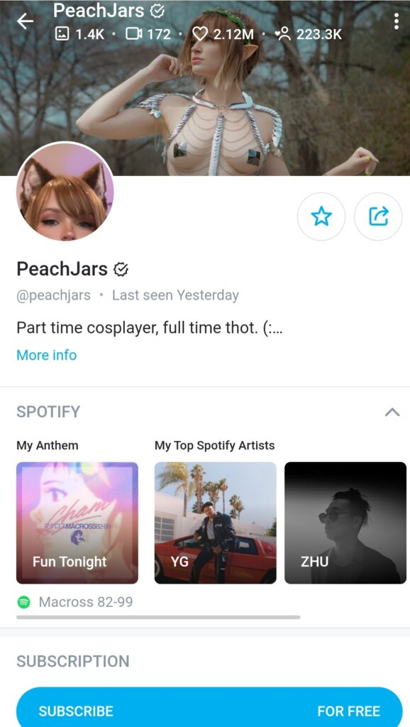
In Peachjars case her page is Free, and she is re-enforcing her brand identity as a nerd who likes to cosplay and listen to the type of music her fans do. Unlike some other visuals that get blocked out her spotify list adds a positive visual element to her page. I do feel anything that slides your subscription price even if free down the page isn’t effective. You can see even ShayBaby from earlier in her profile picture has visuals that are blurred out although she is able to add words to those visuals that are enticing. She is using this as a way of backing up what they will be getting when they click on her page. Peachjars should likely use this same technique with names of the type of Cosplay outfits someone would see her in if they click the follow button.
Conversion Factors Help You Get More Followers and Fans on OnlyFans
Although it may seem like all of what was discussed was small ball so to speak compared to the broader picture of your Marketing and Promotion efforts, it’s important to remember that all of those efforts are to lead them to your subscriber page. Much like a website is created to get someone to come to a restaurant but if you got there and the front door was falling apart and the sign outside had words etched off of it you’d worry about going into eat. So to will people abandon your OnlyFans page right at the front door if you don’t give them every reason possible to enter. For a lot of creators they don’t have the opportunity to see 70% of people who come to their page never take any action. If you can just get a few people to come in, take action on your subscriber page you can get them ball rolling towards a lucrative and successful business on the site.
If you are looking for even more helpful hints on promoting and succeeding on OnlyFans please read my Guide to OnlyFans Promotion as well as reach out to me directly @OnlyFansHero on Twitter or email richard@seobounty.com.
If you’re new to OnlyFans and want to support our site you can click here to Sign Up to OnlyFans . Disclosure: SEO Bounty will earn a commission if you sign up via our link but it will not effect the amount you earn from OnlyFans.
